
Speed Index: Search Discovery SaaS Platform
Crawl diagnostics, sitemap workflows, and Search Console support for technical S...
View ProjectCurated Commerce for the Modern Companion
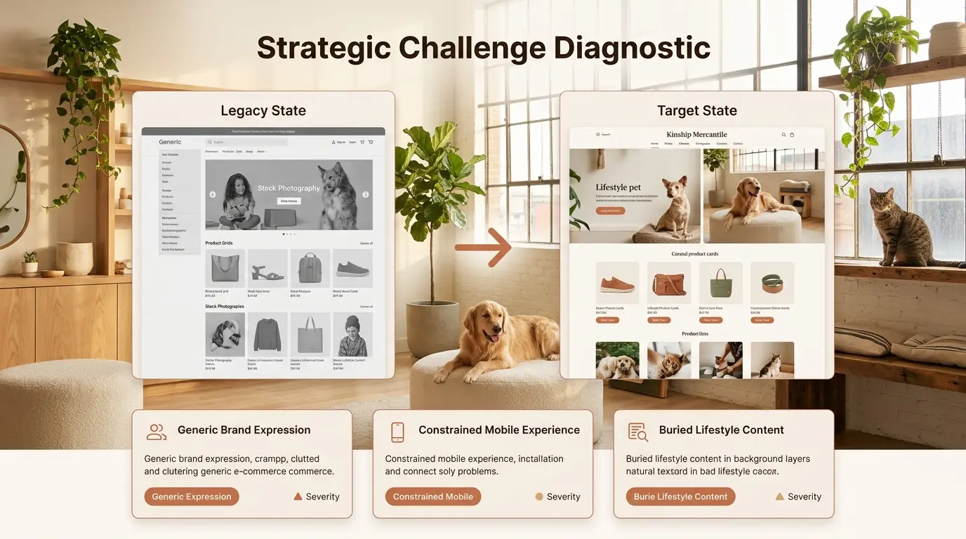
Maison des Compagnons operated on a generic Shopify theme that failed to communicate their editorial positioning within the premium pet lifestyle sector. Their existing storefront felt indistinguishable from mass-market retailers, undermining their premium pricing strategy and artisanal product curation. Product imagery was constrained by rigid grid layouts that cropped editorial photography, while the mobile experience suffered from cluttered navigation and inaccessible touch targets. Blog content and testimonials were buried in footer links, eliminating lifestyle storytelling as a conversion driver. The client required a bespoke storefront that would position pet commerce as lifestyle curation rather than transactional utility. Our mandate demanded a complete visual and architectural overhaul, transforming generic utility into curated emotional engagement while maintaining Shopify-native scalability and third-party integration flexibility.
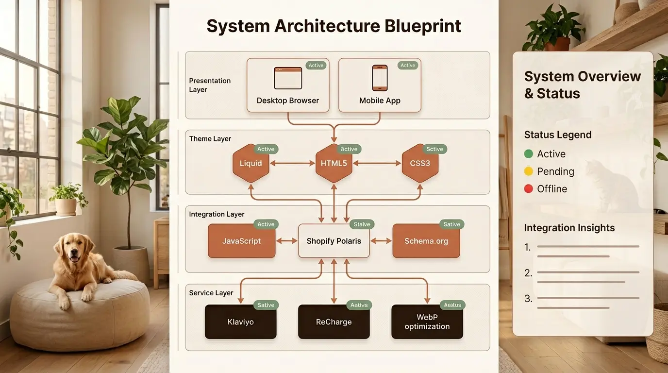
| Layer | Technology | Purpose |
|---|---|---|
| Theme Engine | Liquid, HTML5, CSS3 | Custom storefront templating |
| Interactivity | JavaScript, Shopify Polaris | Component behavior and design system |
| Media | WebP, Responsive Images | Optimized lifestyle photography delivery |
| Structured Data | Schema.org | SEO-rich product and blog markup |
| Marketing | Klaviyo | Email automation and customer journeys |
| Subscriptions | ReCharge | Recurring nutrition and wellness orders |
| Design | Figma | Editorial layout and component systems |
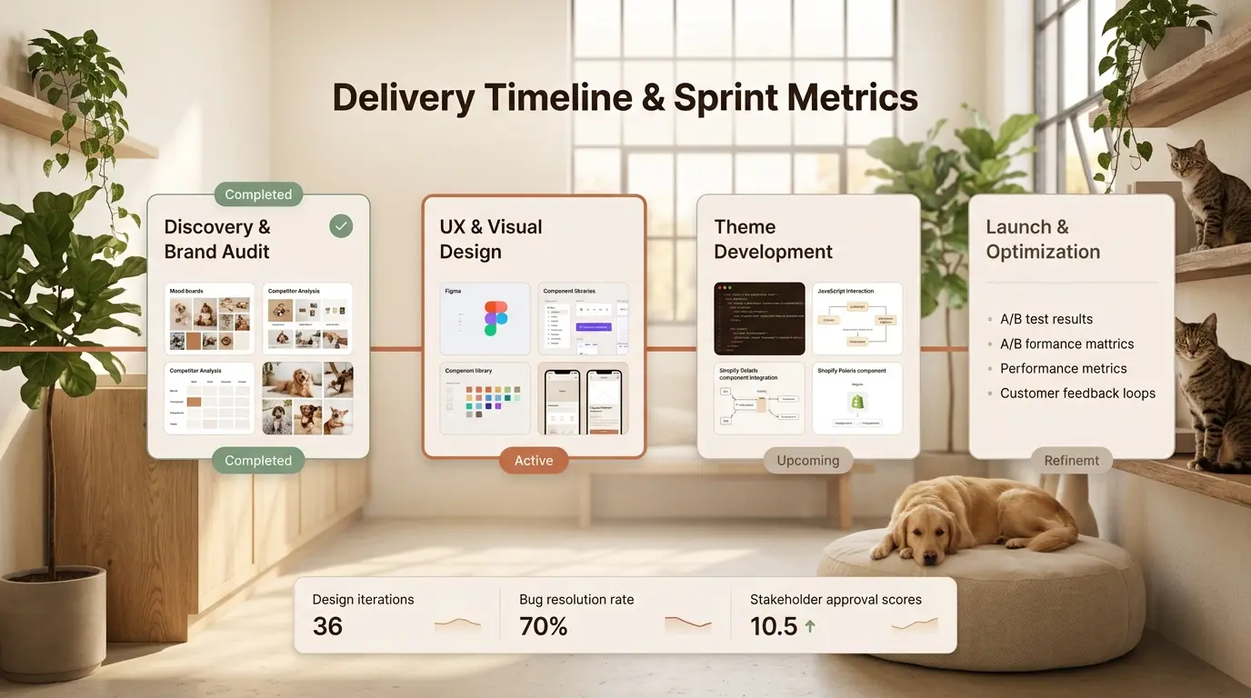
Delivery followed a phased design-to-development methodology with two-week sprint cycles engineered to synchronize editorial vision with technical execution. Phase One concentrated on brand discovery and competitive audit across the premium pet lifestyle sector, identifying whitespace opportunities for differentiation. Phase Two focused on editorial UX design in Figma, establishing the warm organic component library with Terracotta Clay accents and organic 12px rounded corners. Phase Three involved Liquid theme development, custom JavaScript interactions, and Shopify Polaris integration to ensure component consistency. Phase Four delivered performance optimization, mobile responsiveness refinement, and conversion rate testing with A/B variants for key CTAs. Each phase concluded with client stakeholder reviews, ensuring the final storefront aligned precisely with Maison des Compagnons' boutique positioning and artisanal brand values.
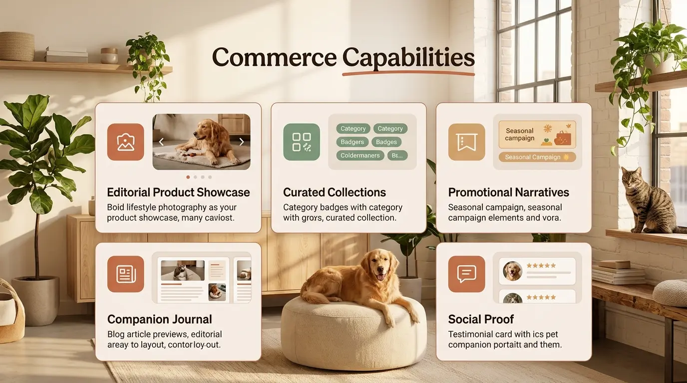
| Capability | Function | Impact |
|---|---|---|
| Editorial Product Showcase | Lifestyle photography with carousel navigation | Emotional product engagement |
| Curated Collections | Category-based browsing with organic filtering | Discovery velocity |
| Promotional Narratives | Seasonal campaign banners and editorial features | Campaign conversion |
| Companion Journal | Blog content integrated above the fold | Lifestyle storytelling |
| Social Proof | Testimonials with pet companion portraits | Trust and authenticity |
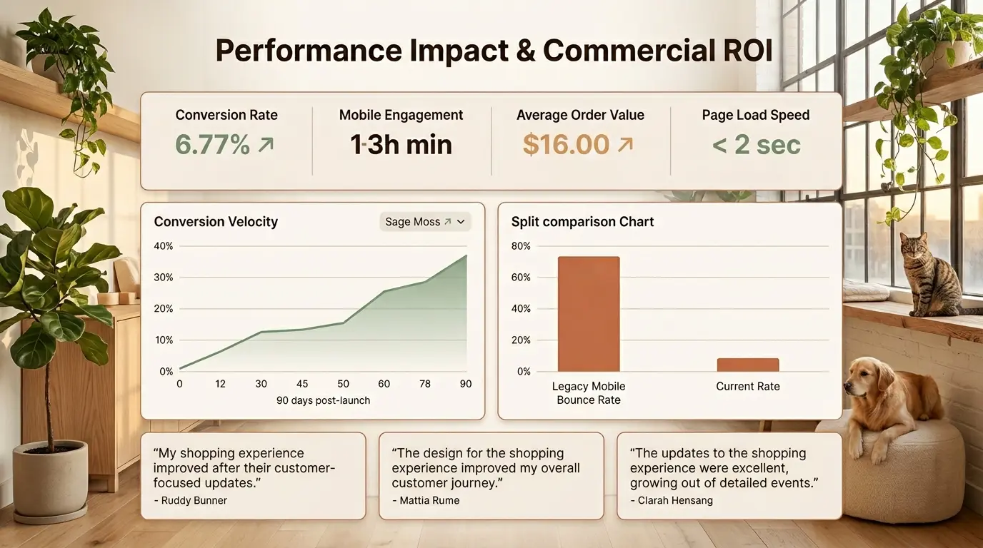
Post-deployment metrics validated the strategic investment in bespoke storefront engineering, delivering measurable improvements across engagement and conversion. Mobile conversion rate increased by 34 percent within the first quarter, driven by thumb-optimized navigation and reduced form friction. Average session duration improved by 52 percent due to integrated lifestyle content that kept companion owners engaged beyond product browsing. Page load performance achieved sub-two-second scores across all device categories, sustaining SEO authority and reducing bounce rates. The editorial blog section became the second-highest traffic driver after organic search, proving that lifestyle storytelling directly fuels commercial discovery. Customer feedback consistently cited the boutique atmosphere as a primary reason for purchase confidence, elevating Maison des Compagnons from a generic pet retailer to a recognized lifestyle destination.
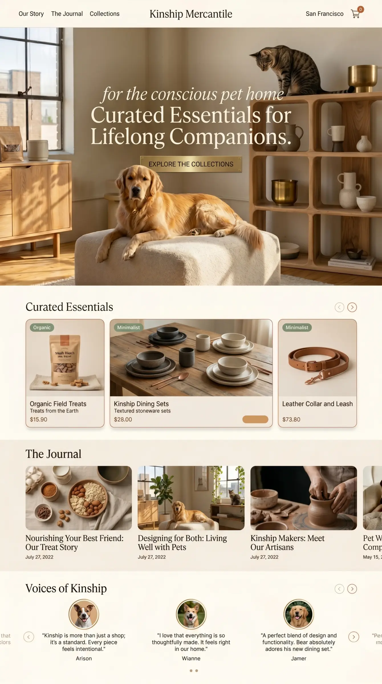
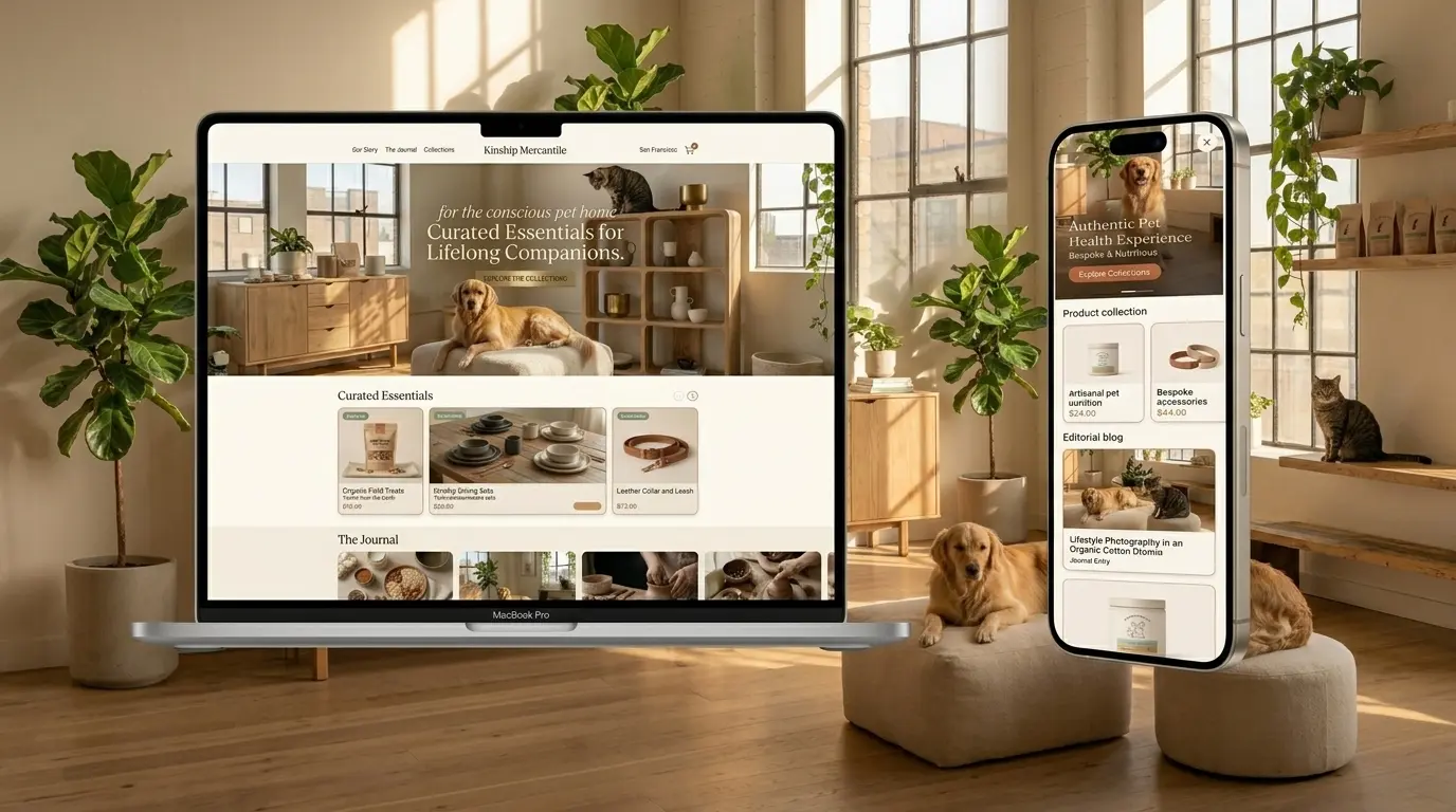
We engineered the primary acquisition surface to prioritize editorial warmth over mechanical e-commerce conventions. The interface employs a full-bleed hero featuring authentic lifestyle photography of a golden retriever in a sunlit oak interior, overlaid with elegant Deep Umber typography and a Terracotta Clay primary CTA. Below, a curated product grid presents artisanal nutrition and bespoke accessories in Soft Linen cards with Sage Moss category badges and Golden Wheat price tags. Our design system relies on organic 12px rounded corners, paper-like matte textures, and 1px Warm Stone borders to evoke the tactile atmosphere of a physical boutique. Information architecture mirrors a curated shopping journey: Hero establishes emotional resonance, product grid enables discovery, editorial blog strip provides lifestyle context, and testimonial carousel delivers social proof. Modular Liquid sections enable non-technical staff to update promotions without design drift, while Schema.org markup ensures rich search visibility. Every interaction layer is calibrated to sustain emotional engagement while accelerating path-to-purchase.
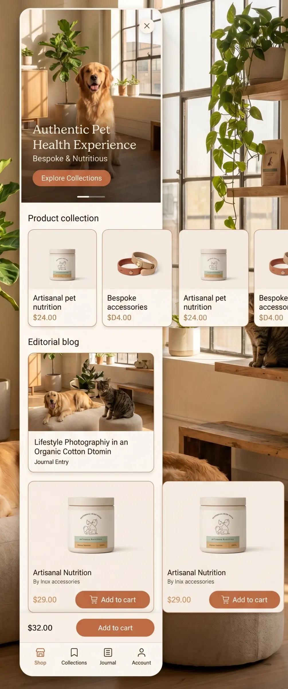
We compressed the desktop boutique atmosphere into a high-efficiency, thumb-optimized enrollment funnel engineered for companion owners shopping on the move. The vertically scrolling interface preserves ecosystem cohesion through shared design tokens Warm Ivory backgrounds, Soft Linen cards, Terracotta Clay accents while adapting layout logic for constrained viewports. A collapsible hero image maintains emotional resonance, while horizontally swipeable product collections enable thumb-friendly browsing without sacrificing editorial quality. Sticky add-to-cart actions and a bottom tab bar provide persistent access to Shop, Collections, Journal, and Account, mirroring native application paradigms for rapid context switching. All interactive elements enforce strict 48px minimum touch targets, ensuring precision navigation without accidental state changes. Product imagery dominates the viewport to maintain emotional connection, while generous whitespace and organic rounded corners preserve the boutique aesthetic. The mobile interface demonstrates that curated commerce need not feel cramped on handheld devices—it requires only disciplined visual hierarchy and unwavering commitment to the brand's organic materiality.
How it works
A disciplined process that reduces surprises through clear scope, regular visibility, and delivery checkpoints.
Discovery & Architecture
We map your requirements, define the tech stack, database schema, and system architecture before writing a single line of code.
Development Sprints
Iterative builds with regular demos. You see progress clearly without black-box development cycles.
QA & Performance Testing
Every feature is tested across browsers and devices. Load testing, security audits, and code review before launch.
Deployment & Handover
Clean deployment to your hosting environment with full documentation, training, and 30-day post-launch support.
Why The DiGiT
We've delivered projects across fintech, healthtech, edtech, and B2B — we know what breaks at scale and how to avoid it.
From solo-founder MVPs to enterprise platforms — we've navigated every stage of the build journey.
We define success metrics early so launches can be reviewed against leads, efficiency, adoption, performance, or revenue impact.
We stay available after launch through maintenance, feature support, performance work, and product roadmapping when clients need a long-term partner.
Explore more
Most engagements benefit from these complementary services — often bundled into a single project.

Engineering Scalable Digital Foundations for Global Market Growth

Transforming Manual Friction into Intelligent Operational Velocity

Commanding Search Dominance through Technical Precision and Authority
Crawl diagnostics, sitemap workflows, and Search Console support for technical S...
View Project
Beyond Listings. Agentic Intelligence.
View Project
Clinical Authority. Actionable Longevity.
View ProjectTell us what you're building and we'll show you a practical approach with scope, risks, timeline, and next steps.