
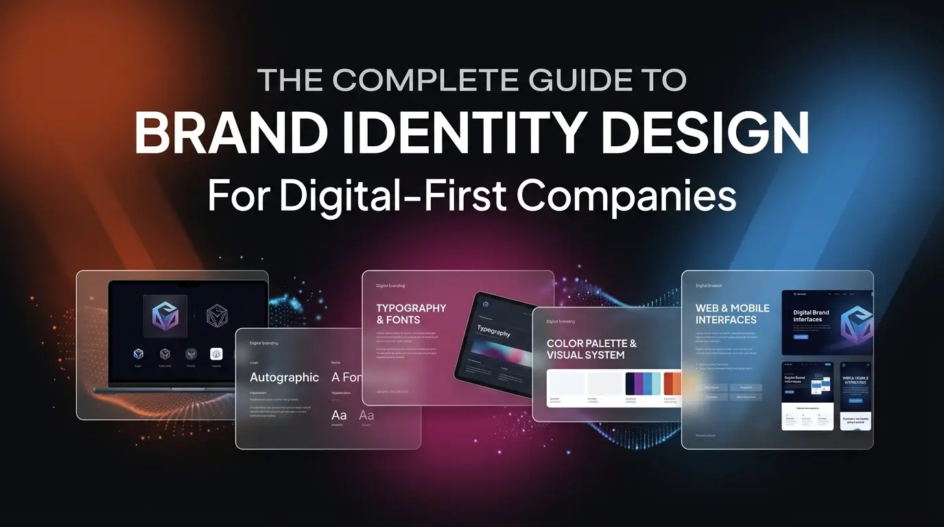
Introduction: Brand Identity Is Not a Logo
The most common mistake digital-first companies make is confusing a logo with a brand identity. A logo is a single element of your visual identity. A brand identity is a complete system of visual, verbal, and experiential elements that work together to create a consistent, recognizable, and emotionally resonant presence across every touchpoint where your customers interact with your business.
In the digital-first era, your brand identity must function seamlessly across websites, mobile apps, social media platforms, email communications, presentations, and printed materials. It must scale from a 16x16 pixel favicon to a billboard-sized banner without losing its integrity. And it must be systematic enough that your entire team can apply it consistently without needing a designer for every decision.
At The DIGIT HQ, we design brand identity systems that are engineered for digital products. This guide covers every component of a modern brand identity and provides actionable guidance for building one that supports your business growth.
The Foundation: Brand Strategy Before Visual Design
Before selecting a single color or sketching a single letterform, you need clarity on three strategic questions:
- Who are you? What is your company's mission, values, and personality? Are you authoritative or approachable? Innovative or reliable? Playful or serious?
- Who are your customers? What are their demographics, preferences, and expectations? What visual language resonates with them?
- Who are your competitors? What visual territory do they occupy? Where is the opportunity to differentiate?
The answers to these questions inform every design decision that follows. A fintech company serving enterprise clients requires a fundamentally different visual language than a consumer wellness app, even if both are "digital-first" businesses.
Logo System Design
A modern logo system is not a single image. It is a family of related marks designed for different contexts and applications.
Primary Logo
Your primary logo is the full, preferred version that appears on your website header, business cards, and presentations. It typically combines a logomark (symbol) with a logotype (wordmark). The primary logo should work at sizes from 200 pixels wide (website header) to several meters wide (event signage).
Responsive Logo Variations
Digital products require logo variations that work at different sizes and aspect ratios. At minimum, you need a horizontal lockup for wide headers, a stacked lockup for narrow containers, an icon-only version for app icons and favicons, and a monochrome version for single-color applications like embossing or watermarks.
Color System Architecture
Color is the most immediately recognizable element of your brand identity. A well-designed color system provides enough variety for complex digital interfaces while maintaining visual coherence across all applications.
Building a Digital-First Color Palette
We recommend defining your color system using HSL (Hue, Saturation, Lightness) values rather than hex codes. HSL makes it easy to generate systematic color scales by adjusting lightness values while maintaining consistent hue and saturation. This is essential for creating accessible color combinations that meet WCAG contrast requirements.
A complete digital color system includes a primary color with 9 lightness variations (50 through 900), a secondary color with the same variation scale, neutral grays for text and backgrounds, semantic colors for success, warning, error, and information states, and surface colors for cards, modals, and overlays.
Typography System
Typography carries the majority of your brand's personality in digital products. Your type system needs to handle everything from large hero headlines to dense data tables, and it needs to render beautifully across all devices and operating systems.
Font Selection Criteria
- Readability: Choose typefaces with clear letterforms, generous x-height, and distinct character shapes. Avoid decorative fonts for body text.
- Performance: Web fonts add to page load time. Select typefaces available on Google Fonts or Adobe Fonts with variable font support to minimize file sizes.
- Character Support: If your product serves international markets, ensure your chosen typeface supports the required character sets and scripts.
- Versatility: Select a typeface family with multiple weights (at minimum: regular, medium, semibold, and bold) to provide sufficient hierarchy without introducing additional font families.
Design Tokens and Implementation
For digital products, your brand identity must be translated into design tokens: named, reusable values that encode your design decisions into a format that both designers and developers can reference. Design tokens ensure consistency between your design files and your production code.
This is where our UI/UX Research and Interaction Design expertise intersects with brand identity. We do not just design beautiful brand systems. We engineer them for implementation in real digital products built with React, Vue.js, Flutter, and Laravel.
Brand Guidelines Documentation
A brand identity is only as good as its documentation. Without clear, comprehensive guidelines, your brand will fragment across teams, agencies, and channels. Your brand guidelines document should cover logo usage rules and clear space requirements, color specifications in all relevant formats (HEX, RGB, HSL, CMYK, Pantone), typography hierarchy with specific size, weight, and line-height specifications, spacing and layout grid systems, iconography style and usage, photography and illustration style direction, and voice and tone guidelines for written content.
Brand Identity in Action
Our approach to brand identity design is best illustrated through our portfolio work. Projects like KINDRED demonstrate how a thoughtful brand identity system creates a cohesive, emotionally resonant experience across a complex digital platform. Every color choice, every typographic decision, and every interaction pattern reinforces the brand's core values of transparency and community impact.
The Solstice Journeys brand identity showcases our ability to create premium, aspirational visual languages that differentiate in competitive markets. From the color palette to the imagery style to the micro-interactions, every element was designed to evoke the feeling of curated, luxurious travel.
Getting Started With Your Brand Identity
If your current brand identity was designed five or more years ago, or if it was created without considering digital applications, it is likely holding your business back. A modern brand refresh does not mean abandoning your brand equity. It means evolving your visual system to meet the demands of modern digital products and audiences.
Contact The DIGIT HQ for a brand audit. We will evaluate your current identity against modern standards and provide recommendations for improvement.